Uncategorized
Lies, Damned Lies, And Statistics
Lies, Damned Lies, And Statistics
By Peter Tchir of Academy Securities
Lies, Damned Lies, and Statistics
As we navigate through a month…
Lies, Damned Lies, And Statistics
By Peter Tchir of Academy Securities
Lies, Damned Lies, and Statistics
As we navigate through a month of partially staffed trading desks, it is more difficult than usual (and it is always difficult) to tell whether narratives are pushing markets or markets are pulling along the narratives.
Are bond yields rising because there are so many bearish views being expressed (with the data to back up those views)? Or was the data already there and when bonds started to sell-off, those headlines (and the bears) just gained prominence? Ditto for the recent shift in articles away from the “soft landing” scenario. A soft landing seemed like a “certainty” a few weeks ago, but now it seems to be losing a little bit of steam. Did that cause stocks to sell off (about 2% last week and almost 5% for the S&P 500 this month), or did the sell-off just highlight the risks (that had gotten buried on the back pages) to the forefront?
Making it even more confusing is how easy it is right now to pick and choose data to spin almost any narrative you want.
For this weekend’s report, after a great week in our San Diego office (where Bloomberg TV interviewed us primarily on China), we wanted to focus on some statistics that have caught our eye and can also be used to spin a variety of narratives.
China
You had me at China. If there is a country whose data fits the lies, damned lies, and statistics theme it is China. However, if Bitcoin was a country, it too might qualify, but it isn’t a country so it gets a pass for now.
We will come back to China, but I just wanted to use the line “you had me at China” before you got bored of reading the report, or it got buried below a bunch of charts.
The Consumer is Tapped Out
Despite retail sales (reported on Tuesday) crushing it (a 1% increase for the control group in July after a 0.5% increase in June), there is a narrative that the consumer is getting tapped out.
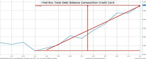
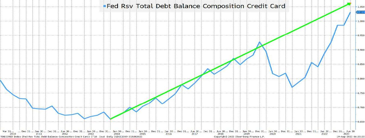
Fastest Ever Rate of Increase in Credit Card Debt!!
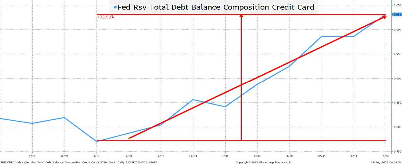
Credit card debt has been rising at what seems like an alarming rate.
Credit Card Delinquencies Gapping Higher!
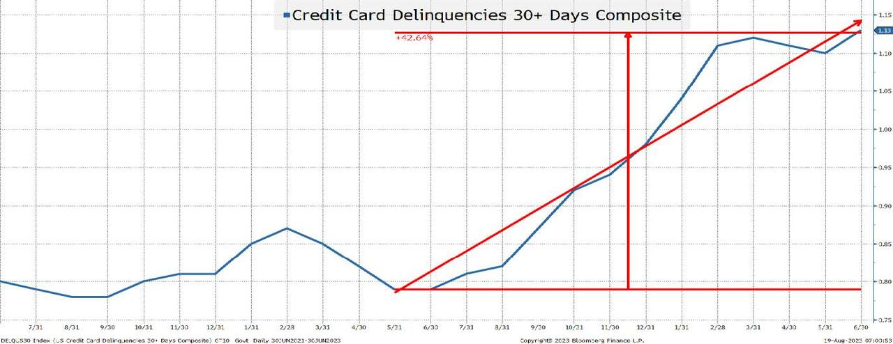
This chart seems almost scary because it shows a rapid rise in delinquencies. While not quite “parabolic” it has increased by almost 50% in a little over a year! However, 0.8% to 1.15% seems a lot less scary than saying it has increased by 50% (which is why I tune out whenever anyone talks about credit spread moves in percentage terms).
Not only is credit card debt rising at an alarming rate, it is also coming just as delinquencies spike higher!
The Consumer is Normalizing
Let’s revisit the prior two charts but use a different time horizon.
Credit Card Debt Remains Below Trend
Credit card debt rose at a steady pace from 2013 until late 2019. Then COVID, stimulus, work from home, and supply chain issues all seemed to coalesce into an amazing drop in credit card debt. While we can question whether credit card debt should have been rising at the rate that it was before COVID (and whether it was sustainable or not), we should just accept that it was. Maybe population growth has changed (or it was some other factor), but if you “strip out” the COVID phenomenon, we are basically back to trend. I do think that credit card balances are an issue, but it is an issue that we seem to have dealt with in the past.
On credit cards, I completely ignore any impact from Fed hikes because credit card interest rates have always been very high relative to any other rate. What drives credit card balances doesn’t seem to be a thoughtful analysis of rates. It has always been (at least to some degree) about instant gratification.
Bottom line is that while the trend may not be sustainable, the recent rise just brings us back to trend, which takes some of the sting out of the fact that the consumer is in dire trouble.
Delinquencies are Below the 5 and 10-Year Averages!
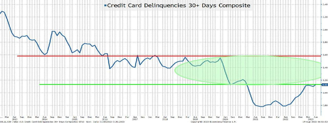
So, delinquencies aren’t even back to pre-COVID levels. This data series averaged 1.5% for the 5 years prior to April 2020, and was 2.1% for the 10-year period before COVID (and let’s not even think about where it was post GFC).
I’m not all warm and fuzzy about the consumer, but I’m not alarmed either.
Auto Loans
Auto loans are a bit trickier. From the consumer’s point of view, they tend to be at a fixed rate and many were entered into when rates were low. In fact, if memory serves me correctly, the average maturity of auto loans extended in recent years allowing consumers to lock in low rates for longer (hopefully the lenders hedged their rate exposure on those auto loans).
Used Auto Prices are Receding
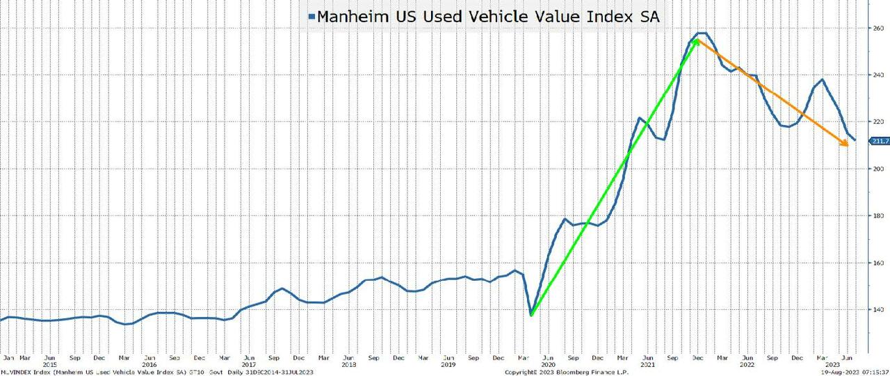
Used car prices are declining from record highs. That may pose problems to lenders who calculated too much residual value on loans and leases to consumers who thought that we were in a brave new world where even used cars went up in value.
Having said that, the prices for used cars remain robust and my understanding is that it is still extremely difficult to buy the most popular new models (and they often fetch a premium to NAV). Nothing like in the heyday of the supply chain issues, but something that should “normalize” over time.
Auto dealers benefited from a lack of inventory, and I will be curious to see if they can retain their sales with low levels of inventory and (ultimately) pass some of those efficiencies through to the consumer.
With autos being such an important part of the economy, it is something that I watch, but much like the story we heard in credit cards, a lot of the negatives that I’m reading about are simply a “normalization” which may be healthy for generating not just a soft landing, but a sustainable soft landing. However, the “slowing” is something to think about.
The Excess Savings Lie
I will spare you the agony of going through bank deposit charts on a short-term and long-term basis and just jump straight to the long-term chart. I used purple and orange arrows because I generally reserve green for good and red for bad and I’m not sure that these are “good” or “bad” deviations from trend.
Bank Deposits are Falling! But to Levels Still Around Trend.
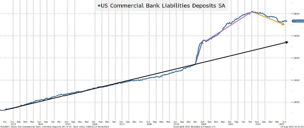
I have argued that the “excess” in bank savings was never going to be put into the stock market (one of the bull cases, which may even still be floating around). I also think that there is a lot more than meets the eye about why there is so much in “excess” savings. Sure, without a doubt, COVID boosted savings. One thing that I “forgot” to mention earlier (or maybe I saved it on purpose) about the good things that happened to consumers during COVID is that there were many moratoriums placed on various types of debt service (i.e., student loans).
We can all agree that some amount of cash stayed in savings accounts because while savings accounts earned 0%, so did everything else. As people realized that they could earn more on their money market funds, some amount was going to be taken out of savings accounts paying little interest. Though, I do have to say that I was at the local bank branch a few weeks ago taking out money from the ATM and someone before me had left a receipt showing $99k in their bank account. I immediately thought “who does that?”, but there are obviously people who want bank accounts up to the FDIC limit.
My view has been (and will continue to be) that many people “earmarked” money that they would have to pay in the future and set it aside in a savings account. If you know moratoriums will end (and let’s not forget, these loans typically accrued interest during these periods), then it would be prudent to set aside some money for when those payments got turned back on.
If my theory is correct, you should see bank deposits decline faster as these moratoriums end and the money that was “earmarked” for certain payments is withdrawn to make those payments. Please see American Ingenuity.
Not great for the economy or spending, but is “normalization” really bad?
Generative AI
My intention is to use generative AI to help me do a report on “outliers”. This would include warning signs or positive things that the market may or may not be missing. After about an hour or so of brutally failed attempts this weekend, I gave up. I try to write these T-Reports with an estimate of how long it will take and how long the report will be but had absolutely zero clarity on whether the ChatGPT process would work. Hopefully I can make some interesting progress on the report early this week or I will declare it a failure. In any case, was Google trends (using generative AI) all you needed to buy or sell stocks successfully this year?
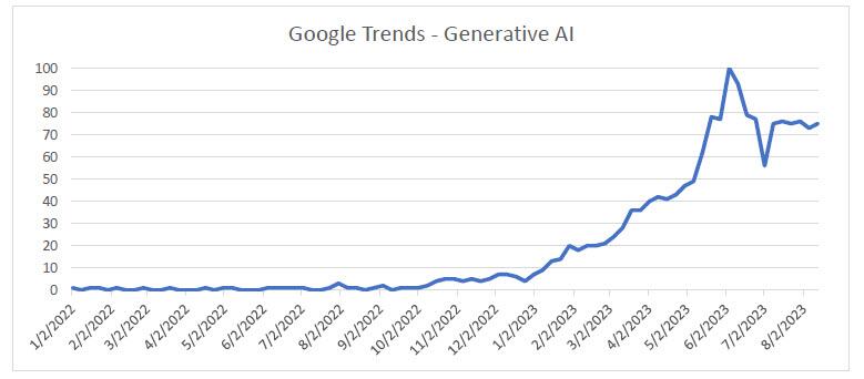
No one really cared about AI until February of this year. Yes, there were some searches, but very few. The Nasdaq 100 bounced in January, stagnated for a bit, and then started to do well from April until late July. It has sold off steadily since then. While not matching the trends in “generative AI” search, it might have been the best tool to use. The searches have stabilized and what will be interesting to see is if they peaked or if they increase as we end the summer and people are back at work fulltime across the board.
We will be focusing more on AI as Academy’s Advisory Board has grown the number of advisors with significant experience in the area and who are active today in the ongoing development of cyber and AI.
China
I promised that we’d get back to China, but for now I only want to highlight one chart. And, ironically, it is not a lie. It is the truth, and it is logical.
China’s Holdings of U.S. Treasuries
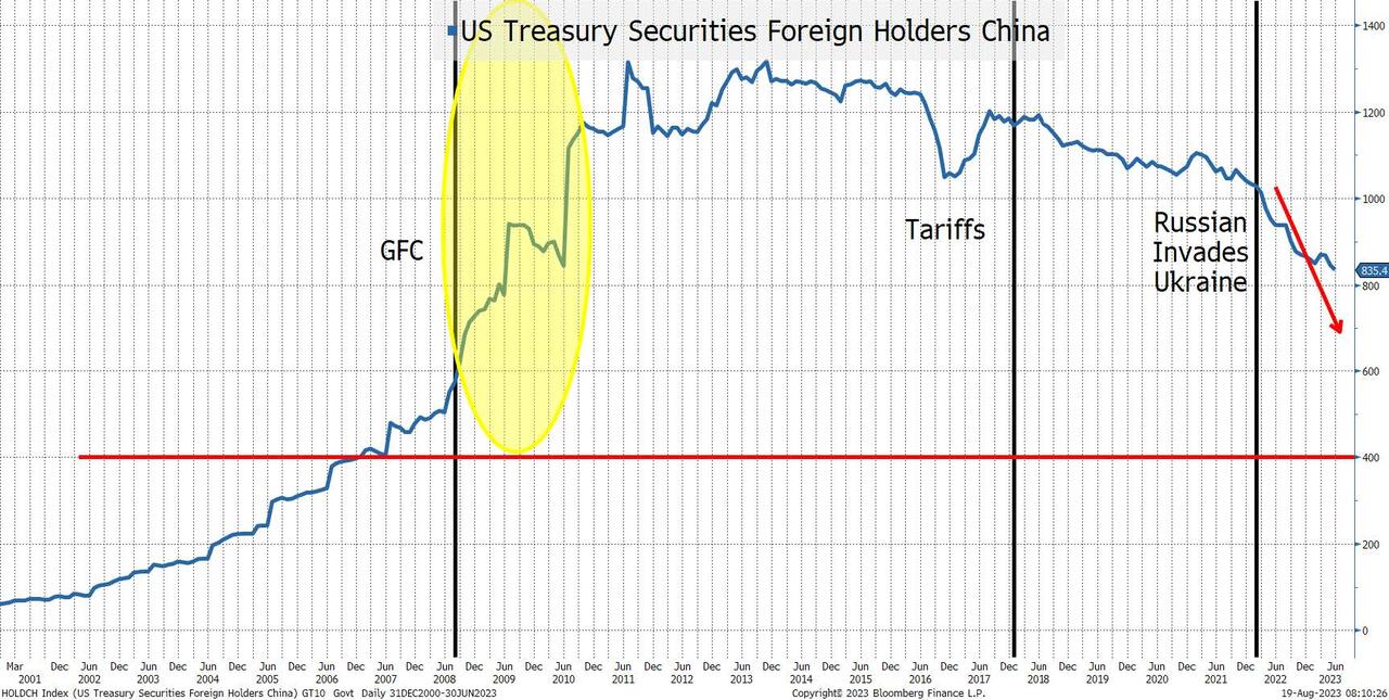
I highlight three periods.
- Post GFC. When the U.S. economy was in tatters and much of the world was struggling, China was able to (or was willing to) accumulate more and more Treasuries. There is a lot of chatter about the decoupling of our economy from China’s right now, which is logical and will continue (the friction is real between the two nations and not getting better). I did, however, find it interesting that China accumulated so many Treasuries in the aftermath of the GFC. Prior to the GFC, the trend seemed obvious (U.S. was growing and buying stuff from China).
- The tariffs sparked some discussion of potential retaliation from China, including the possibility that they would dump Treasuries. There was some decline in their holdings, but that could just as easily have been COVID related.
- Since the Russian invasion of Ukraine and the decision to freeze Russia’s dollar holdings, there has been a steady decline in China’s Treasury holdings.
- Some of the decline is due to the weakness in China’s economy and their potential need to prop up the property market (and maybe even those overly exposed to the “shadow banking system”).
- Not only did we freeze Russia’s holdings (which tells me that we can do it again), but we have also been going after China on a myriad of fronts (most notably high tech, but increasingly for rare earths and critical minerals).
- Our own debt ceiling issues and ratings may not help, but I’d be shocked if that entered into China’s calculus.
- What I cannot tell from this chart is if it is an indication that China is successfully generating trade globally in yuan and has less need for dollars. That would fit my “shifting from made in China to made by China” view to a tee, but I’d be lying if I said that I could support that on this chart! Maybe generative AI will help me find evidence supporting that theory in places that I haven’t thought to look.
One thing that I think supports Treasury market bears is that there will be less of a global interest in holding Treasuries (with China leading the way).
Jobs
So much to do here and with or without AI, I will add more charts related to jobs later this week.
We have covered some of these areas in the past such as discrepancies in JOLTS between job openings and hires and the Establishment versus Household gaps. The fact that all these reports come in with declining response rates is another issue. It is difficult (mathematically) to accept the continuity of a data series when the response rate is declining without a serious investigation into why the response rate might be declining.
While we haven’t discussed it recently, the annual revisions always seem to dramatically reduce the published data for the prior year (but weirdly it doesn’t seem to have a market impact).
Today, I just bring up one chart because I find it fascinating in the lies, damned lies, and statistics theme.
The “Almost” Unbelievable Pattern of New Company Formation
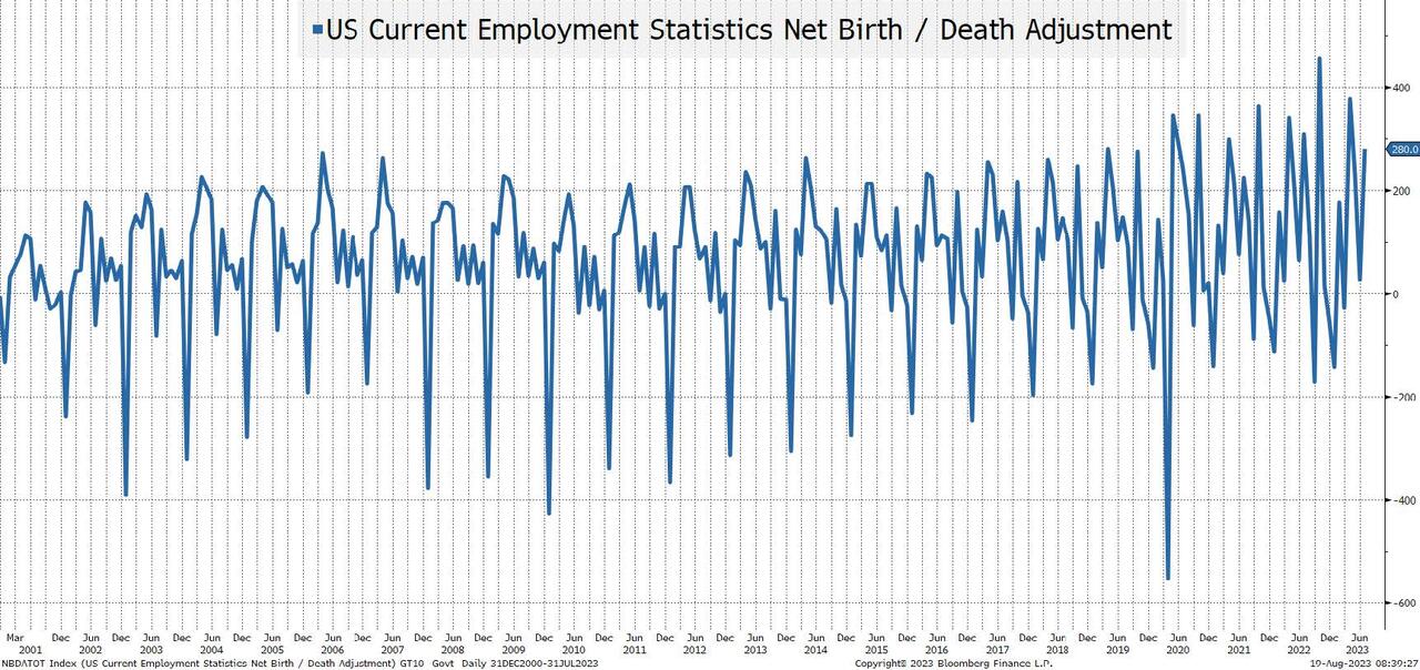
The birth/death model is an estimate of jobs created or lost as new companies are formed or go out of business (or at least close enough for our purposes).
I challenge you to find any other jobs data that looks this “perfect”. It is a beautiful sawtooth pattern that looks almost uninterrupted! For most jobs data, the COVID period makes long-term charts almost impossible to review. The job losses and subsequent job gains are so large relative to any prior periods (or current periods) that these charts look like straight lines on either side of COVID.
Yet this chart seems almost perfect. This is a symmetrical “beauty”, but it is just a “plug”. It is something that clearly relies heavily on seasonality and I find it almost impossible to believe that this is so “predictable” (which makes me wonder how many other “plugs” or adjustments might be meaningless after the COVID shock). Meaningless, but this data is still used to determine policy and drive markets.
Inflation
I couldn’t be bothered. Sure, I will dig into this more, but I really don’t think that despite some Fed jawboning, anything (other than a large/sustained change in inflation) will do much to the Fed’s decision (which means that it will do little for bond markets). I am prepared to be wrong on this and will delve into it this week (with help hopefully from friends at ChatGPT), but inflation is low on my radar screen. However, there is one exception – will companies be able to grow earnings in the current inflation environment where it seems to be more difficult to push through final product price increases while input costs remain elevated?
Bottom Line
Seems like we are back to an “inflection” point where the debate between soft landing and “something less fun” is back on the table. The lag effect is regaining credibility (it always should have).
There are cases to be made for a variety of economic outcomes as we head into September and that is exciting from my seat!
I do think that we are in a period where price action drives what narratives we see: continued downward pressure on stocks will bring out more and more negative reports. One more short squeeze and suddenly AI, soft landing, and praise for Powell is all that we will see.
Tyler Durden
Sun, 08/20/2023 – 15:30
nasdaq
rare earths