By calling into question the value of a significant portion of the country’s bank deposits, the recent failure of one or more regional banks is equivalent to a sudden tightening of monetary policy, in which the supply of money is perceived to have contracted while the demand for the remaining portion has increased.
Background: The “ideal” money can be defined as a highly liquid, universally-accepted medium of exchange that holds its value over time and can—but not necessarily—also pay a floating rate of interest, e.g., currency, checking and demand deposits, and retail money market funds. M2 incorporates all of these and is thus an excellent way to track the supply of money.
Therefore, we might say that the current banking crisis is being caused by the perception that some portion of M2 (e.g., bank deposits in regional banks) may lose—or may have already lost—value in the event of a bank failure or expected bank failures. That perception automatically triggers an increased demand for the rest of M2. Together, this has the same effect as a sudden tightening of monetary policy; the supply of money has decreased at the same time the demand for money has increased.
If the Fed does not offset this effective tightening by reducing interest rates, things could get ugly. Reducing interest rates does two things: 1) it makes holding money less attractive on the margin, and 2) it makes borrowing money more attractive on the margin. This serves to reduce the demand for money while at the same time increasing the supply of money (because an increase in loans expands the supply of money). Together they amount to a relaxing of monetary policy, and that is the appropriate response to a sudden and unexpected tightening of monetary policy.
The Federal Open Market Committee (FOMC) meets on Wednesday, March 22, at which time they are expected to make what is now an extremely important decision: will they raise rates, hold rates steady, or cut rates? The market seems to expect they will most likely hold rates steady. I would argue they should cut rates, as my argument above suggests, and I hope they do.
Some helpful charts for background follow:
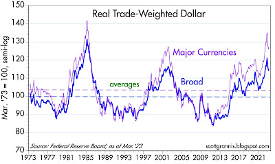
Chart #1
Chart #1 shows the inflation-adjusted value of the dollar relative to a trade-weighted measure of other currencies. By any measure the dollar is strong, and significantly stronger than it has been for most of the past half-century. Judging by this evidence, the dollar is still the world’s premier currency. We could also infer that there is no excess supply of dollars relative to the world’s demand for dollars. This further suggests that a sudden tightening of US monetary policy (as described above) could boost the dollar’s value further, thus negatively impacting nearly every other currency on the planet. A strong currency is very important, as is a stable currency. A strong and appreciating currency is not necessarily a good thing.
Chart #2
Chart #2 compares the value of the dollar (using a popular but less robust measure of the dollar’s value than that used in Chart #2) to the inflation-adjusted price of gold. (Note: I have inverted the dollar, so a falling blue line represents a stronger dollar.) If the dollar and gold were competing “safe ports in a monetary storm” then a stronger dollar might coincide with a lower gold price, and vice versa. That has been the case of many years, as the chart suggests. In recent years, however, the dollar has appreciated alongside a rising gold price. Is the dollar “too strong,” or is gold “too strong?” I don’t have a good answer to that, unfortunately.
Chart #3
Chart #3 shows the level of the Fed’s balance sheet. Last week, the Fed’s balance sheet jumped by about $300 billion, the result of the Fed extending credit to troubled banks in exchange for those banks posting notes and bonds as collateral for an emergency loan. Did the supply of money also increase? We won’t know the answer to that question until the release of March M2 statistics on April 25th. I would also note that there has been no appreciable shrinkage in the Fed’s balance sheet despite their professed intention to do so.
Chart #4
Chart #4 shows the level of bank reserves held on deposit with the Fed by the nation’s banks. For decades prior to 2008, bank reserves were only a tiny fraction of what they are today. That’s because bank reserves paid no interest prior to 2008, and banks were required to hold reserves in order to collateralize their deposits. Thus, banks held only the absolute minimum amount of reserves they were required to hold. After 2008, the Fed began paying interest on reserves, and so banks came to view reserves as a valuable asset: highest quality, risk-free, default-free, and paying a floating rate of interest. In short, reserves came to be viewed as functionally equivalent to T-bills, and banks were happy to load up on their holdings of reserves.
By any measure, and from an historical perspective, there is an abundance of bank reserves today. The Fed is not significantly restricting the supply of this very important asset like they did prior to 2008, when the Fed intentionally restricted the supply of reserves in order to boost market interest rates (banks that wanted to expand their lending were forced to borrow reserves from other banks, and that boosted short-term interest rates). That is one good reason to think that the banking system and financial markets today are more resilient than in prior Fed tightenings.
Chart #5
Chart #5 shows the level of 2-yr swap spreads. (See my swap spread primer
here.) This is an all-important measure of liquidity in the banking system (the lower the spread the greater the liquidity) as well as the financial health of the economy (the lower the better). Note that in the wake of the SVB crisis, swap spreads have
fallen. This dovetails with Chart #5 in the sense that both suggest that there is abundant liquidity in the banking system, and that’s a very good thing.
Chart #6
Chart #6 shows the level of Credit Default Swap spreads, which is a very liquid and generic indicator of the market’s perception of the health of corporate profits, and by inference the health of the economy. These spreads have risen somewhat in the wake of the SVB crisis, but not significantly, and that’s a good thing, since it means the economy is not likely on the cusp of recession.
Chart #7
Chart #7 shows the level of nominal and real 5-yr Treasury yields and the difference between the two, which is the market’s expectation for what CPI inflation will average over the next 5 years. By this measure, the market is saying there is almost no problem with the outlook for inflation. Whatever the Fed has done to date has been sufficient to tame the inflation beast that awakened (unexpectedly, for those who have not followed this blog) over a year ago.
Chart #8
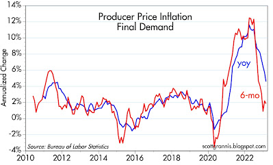
Chart #8 shows the year over year and 6-mo. annualized rate of change in the Producer Price Final Demand index (i.e., inflation at the wholesale level). Both measures have dropped significantly from their peaks of last year. This is a good approximation of what we likely will see happening with the CPI over the course of this year.
dollar
gold
inflation
monetary
markets
policy
interest rates
fed
monetary policy