Economics
Inflation-Adjusted, Men Are Making Less Money Than In 1979; Women Are Doing Better
Inflation-Adjusted, Men Are Making Less Money Than In 1979; Women Are Doing Better
Authored by Mike Shedlock via MIshTalk.com,
BLS charts…
Inflation-Adjusted, Men Are Making Less Money Than In 1979; Women Are Doing Better
Authored by Mike Shedlock via MIshTalk.com,
BLS charts show interesting trends in real (inflation-adjusted) weekly earnings. Men are getting clobbered relative to women, but everyone is losing lately…
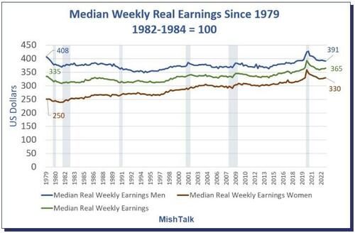
Median real earnings from the BLS, inflation adjusted to the 1982-1984 CPI Index, chart by Mish.
Median Weekly Real Earnings
-
In the first quarter of 1979 men were making $408 weekly. Today, men are making $391.
-
In the first quarter of 1979 women were making $250 weekly. Today women are making $330 weekly.
-
Collectively, people were making $335 then and now they are making $365.
Men are getting clobbered, down 4.2 percent, while median women’s earnings have risen 32 percent. These numbers may look silly but you can verify them on the St. Louis Fed FRED database.
Wait, you say, people are taking home more than $365 weekly. Yes they are, in nominal terms. Normally I take numbers and adjust them for inflation. This data is already inflation adjusted, so I had to un-adjust the data.
Median Weekly Earnings and Real Earnings Since 1979
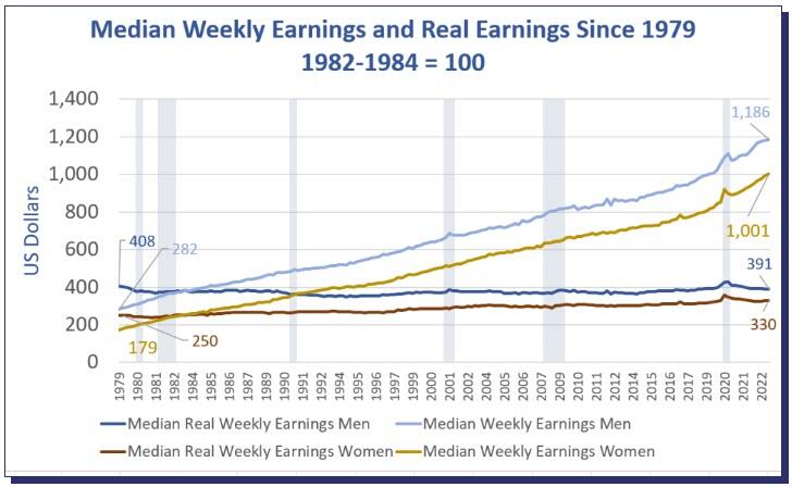
Median real earnings from the BLS, nominal earnings and chart by Mish.
In nominal terms, men were making $282 weekly in 1979 and $1,186 weekly today. Adjusted for inflation, $282 bought 4.2 percent more in 1979 than $1,186 does today.
Women have certainly fared better. In nominal terms, women were making $179 in 1979 and $1,001 today. In real terms that’s a jump from $250 to $330, a gain of 32 percent.
Nominal and Real Average Wages
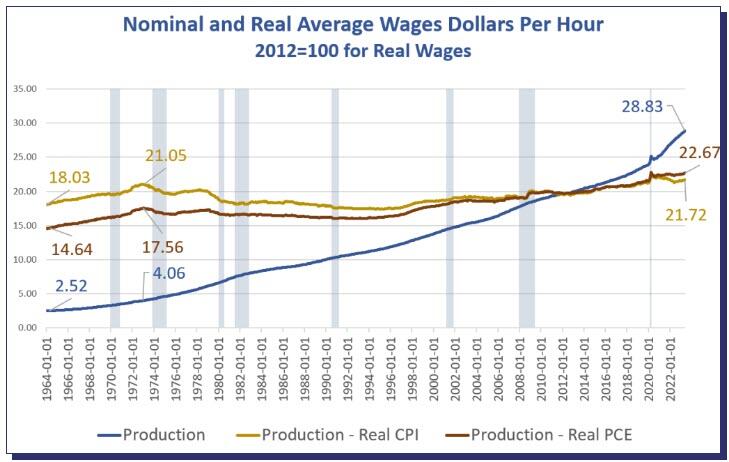
Nominal hourly wages from the BLS, real wages and chart by Mish.
In contrast to the first set of data where wages are weekly, and calculated quarterly, the BLS produces hourly data monthly. The calculation for this set is the reverse. The BLS shows nominal hourly wages and I calculate real wages.
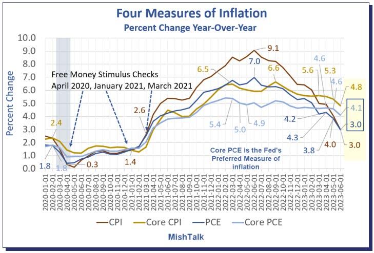
Last week, someone on Twitter asked what earnings look like adjusted by the PCE price index. Economists tend to use 2012 as the base year for PCE so that is what I used as well. It doesn’t matter, so don’t dwell on the difference in the index year.
For both charts, I went back as far as the data was available. This chart is for production and nonsupervisory workers, not all workers. The hourly data for all workers only dates to March of 2006.
The BLS does not break out average hourly wages by sex. In terms of average hourly wage, the peak was February of 1973. For comparison purposes it’s too bad that data for the first chart does not go back as far.
As a cross check of the first chart calculation, take $28.82 hourly x 40 hours per week and you get $1,153 weekly.
February 1973 vs Today
-
In nominal terms, production workers were making $4.06 per hour. Today they are making $28.83.
-
In real PCE terms, production workers were making $17.56 then and $22.67 now, a 29 percent total jump over 30 years, about 1 percent a year.
-
In real CPI terms, production workers were making $21.05 then and $21.72 now, a 3.2 percent total jump over 30 years, essentially nothing.
We can deduce from the first chart that men are getting clobbered relative to women in both median and average terms. You can also say women are slowly catching up to men. Since we do not have a job-by-job breakdown, it’s not easy to quantify these expressions accurately.
What About Housing?
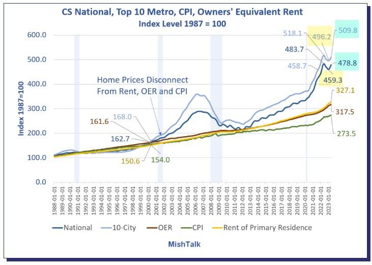
Case Shiller National and 10-City home prices indexes plus OER, CPI, and Rent indexes from the BLS.
Chart Notes
-
The latest Case-Shiller home price indexes is for May. It represents repeat sales of the same house in roughly a March-April timeframe.
-
OER stands for Owners’ Equivalent rent. It’s the price one would pay to rent one’s own home, unfurnished, without utilities.
-
CPI is the consumer price index.
-
Rent of primary resident is just what it sounds.
-
CPI, OER, and Rent as as measured by the Bureau of Labor Statistics (BLS).
Home prices wildly disconnected from the CPI in 2000 and in 2013. The disconnect accelerated in 2020.
After a two-month decline in most markets, prices are again on the rise.
Housing Not Directly in the CPI or PCE
Please recall that housing prices are not directly in the either the CPI or PCE inflation indexes. For those wishing to buy a home, both measures of inflation are dramatically understated.
That means real hourly earnings are even dimmer than I presented above.
For discussion of home prices see The Housing Bubble, as Measured by Case-Shiller, Is Expanding Again.
And please consider this question, Is It Time to Bet on an Inflation Overshoot?
* * *
Tyler Durden
Mon, 07/31/2023 – 12:20
inflation
markets
fed
bubble


Argentina Is One of the Most Regulated Countries in the World
In the coming days and weeks, we can expect further, far‐reaching reform proposals that will go through the Argentine congress.

Crypto, Crude, & Crap Stocks Rally As Yield Curve Steepens, Rate-Cut Hopes Soar
Crypto, Crude, & Crap Stocks Rally As Yield Curve Steepens, Rate-Cut Hopes Soar
A weird week of macro data – strong jobless claims but…
Fed Pivot: A Blend of Confidence and Folly
Fed Pivot: Charting a New Course in Economic Strategy Dec 22, 2023 Introduction In the dynamic world of economics, the Federal Reserve, the central bank…