Economics
Do Stock Valuations Support a Bull Market?
How traders are assessing stock and bond returns … a step-by-step diagnostic tool to evaluate valuations … the biggest influence on your portfolio…

How traders are assessing stock and bond returns … a step-by-step diagnostic tool to evaluate valuations … the biggest influence on your portfolio today
Investors have lots of options for where to put their money…
Are stocks worth it, at this moment, in this market, or should they be looking elsewhere?
Today, we’re going to see how our technical experts John Jagerson and Wade Hansen of Strategic Trader answer that question.
Better yet, they’ll guide you through a step-by-step analysis so that you’ll be able to run this same diagnostic by yourself in the quarters and years to come. You’ll walk away a wiser, more informed investor with a new, powerful quantitative tool in your toolkit.
The simple framework to help us price the market
For newer Digest readers, Strategic Trader is InvestorPlace’s premier trading service. It combines options, insightful technical and fundamental analysis, and market history to trade the markets, whether they’re up, down, or sideways.
Returning to today’s analysis, here’s John and Wade to set the stage:
The S&P 500 has been stuck below a down-trending resistance level since reaching its all-time high in early 2022.
The index has tried to break above this level four times during the past year and has failed each time. It’s currently trying again, but so far, it hasn’t been able to break through
This, of course, begs the speculation if the S&P 500 will ever be able to break above this down-trending resistance level.
To address this, we have to look at the investment options that are available to traders and see how they currently compare…
To accomplish this, we need to better understand how Wall Street traders think.
Stocks aren’t the only game in town. There are bonds, real estate, cryptos, private equity deals, foreign assets, commodities, you name it…
At the end of the day, what’s important is the highest risk-adjusted return, or yield. So, how do traders assess their options from this perspective?
Back to John and Wade:
The baseline yields traders typically use when assessing their investment opportunities are Treasury yields – like the 10-year Treasury Yield (TNX) – because they know that Treasuries provide a reliable yield, backed by the full faith and credit of the United States government.
Treasury yields fluctuate as inflation, monetary policy, and economic growth expectations change.
The TNX has been moving lower for the past few months as bond traders have been preparing for the potential of a recession in 2023. It is currently offering a yield of 3.44%
So, 3.44% is our starting point. This is our “risk-free” rate.
From here, investors can evaluate other investment yields.
To address the question about whether stocks are attractive relative to “safe” bonds today, let’s evaluate the stock market yield
How do we do this?
Back to John and Wade:
You look at the earnings yield – which is the earnings the market generates, compared to the price you are paying for those stocks (i.e., the E/P ratio).
If you’ve never heard of the E/P ratio before, you’re not alone. But even if you haven’t, it should look at least vaguely familiar. That’s because it’s the inverse of the P/E ratio.
So, to find the S&P’s earnings yield, we start with its P/E ratio and then flip it.
John and Wade suggest going to a site like multpl.com to get the P/E. As of Wednesday, when John and Wade wrote their update, the S&P’s P/E was 20.64.
Back to the Strategic Trader update:
Now that you know the P/E ratio, all you do is find the inverse of this number to determine the earnings yield on the S&P 500, which in this case is 4.84% (1 / 20.64 = 0.0484).
So, we have our baseline treasury yield of 3.44%. And we have the S&P’s earnings yield of 4.84%. But we’re not ready to compare them quite yet.
Don’t forget to factor in dividends
Dividends play a huge role in the overall profitability of the stock market.
For some color on this, check out the chart below. Dating back to the 1930s and extending through the 2000s, it shows stock market returns by decade.
The first number is the return from dividends. The second number is the return from price changes.
As you can see, dividends are an enormous component of overall returns.
- 1930s: 5.4% / -5.3%
- 1940s: 6.0% / 3.0%
- 1950s: 5.1% / 13.6%
- 1960s: 3.3% / 4.4%
- 1970s: 4.2% / 1.6%
- 1980s: 4.4% / 12.6%
- 1990s: 2.5% / -15.3%
- 2000s: 1.8% / -2.7%
Source: TheBalance.com
So, what’s the dividend yield for the S&P 500?
Using multpl.com again as our resource, we find that it’s 1.69%.
Now, we combine the earnings yield (4.84%) and the dividend yield (1.69%) to get a total yield of 6.53%.
So, what does this mean? Is it good or bad?
There’s one final step we have to take before we reach our conclusion.
Factoring in the historical risk premium
Back to John and Wade:
Traders try not to be foolhardy with these investments. They demand a premium for the increased risk they are taking by putting their money into stocks instead of bonds.
This “risk premium” is calculated by finding the total yield (earnings + dividends) a trader can earn from the S&P 500 and subtracting the TNX.
The risk premium can vary quite a bit depending on market conditions (blue line in Fig. 6), but the average during the past 20 years has been 3.69% (orange line in Fig. 6).
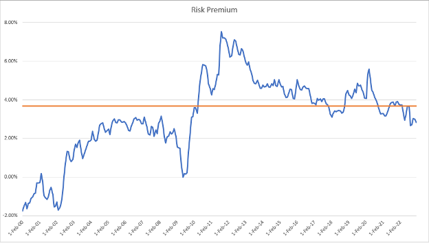
Fig. 6 – Risk Premium Since Feb. 2000
John and Wade point out how the risk premium wasn’t as large during the bull market recovery between 2003 and 2008 (the left half of the chart above, when the blue line is staying beneath the orange “average” line).
This is mostly due to the Fed allowing interest rates to rise during this period. This allowed the TNX to remain higher, which reduced the risk premium.
But after stocks recovered in the wake of the global financial crisis, the risk premium jumped (the right half of the chart above, when the blue line is mostly above the orange “average” line).
This is because the Fed kept interest rates near zero, even though stocks were climbing.
John and Wade note that the risk premium looks to be normalizing and returning to its average after swinging to extremes during the past two decades.
Putting it all together, what does it mean for the S&P’s attractiveness?
Now that we have all the pieces to the puzzle, let’s find out what it’s telling us.
Here’s John and Wade:
If a trader can earn 3.44% on her money by buying virtually risk-free 10-year Treasuries today and were to demand the average risk premium of 3.69% to invest in stocks, then those stocks would have to yield at least 7.13% (3.44% + 3.69% = 7.13%) to remain attractive.
When you compare the 6.53% return a trader could currently get from the S&P 500 with the 7.13% return an investor would demand if she could earn 3.44% on her money by buying virtually risk-free Treasuries and demanded a risk premium of 3.69% to invest in stocks, you can see the numbers are slightly below average but are pretty close to where you would expect them to be.
Plus, the risk premium Wall Street is demanding seems to be trending lower, which is good news for stock prices.
So, where does the S&P goes next?
John and Wade point out that the more the 10-year Treasury yield falls, the more attractive stocks become.
However, the more urgent, impactful influence on stocks right now isn’t so much this holistic return comparison of stocks and bonds, it’s earnings.
Here’s John and Wade take:
…We’re just getting started in earnings season, and we know that a lot can change during this time.
If earnings come in better than expected, watch for the S&P 500 to challenge its long-term down-trending resistance level again and finally break through.
If earnings come in worse than expected, the S&P 500 may be stuck below resistance for a while longer.
So far, earnings are coming in mixed. We’ve seen some great surprises (like Netflix this morning, which topped expectations and is up nearly 7% as I write), some “okay” earnings, and some rather poor ones.
And for a big picture view of this long-term down-trending resistance line, here’s your chart.
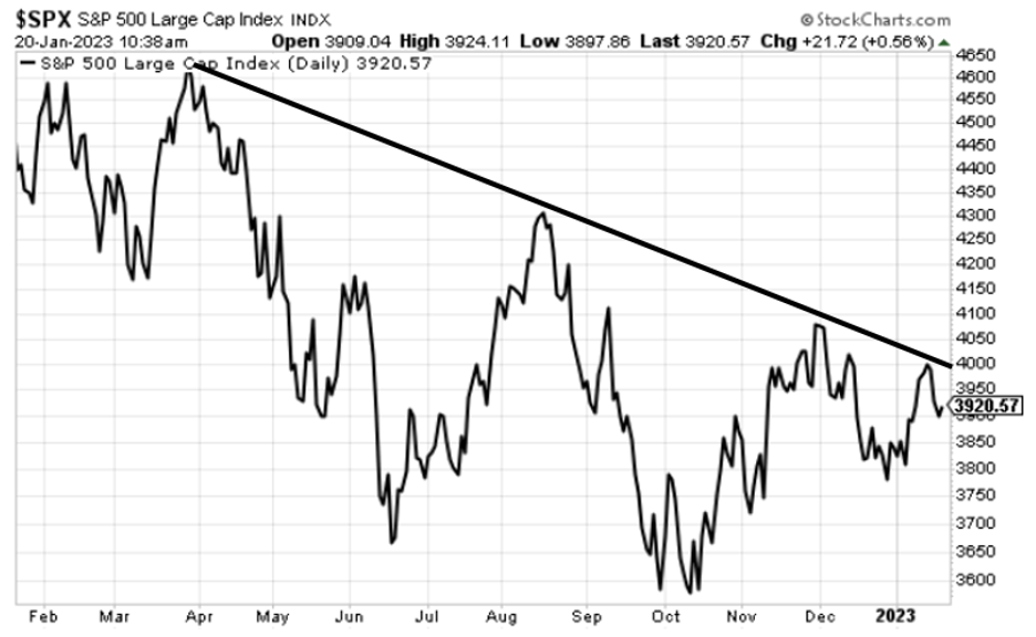 Source: StockCharts.com
We’ll keep you updated here in the Digest.
Have a good evening,
Jeff Remsburg
The post Do Stock Valuations Support a Bull Market? appeared first on InvestorPlace.
inflation
commodities
monetary
markets
policy
interest rates
fed
monetary policy


Argentina Is One of the Most Regulated Countries in the World
In the coming days and weeks, we can expect further, far‐reaching reform proposals that will go through the Argentine congress.

Crypto, Crude, & Crap Stocks Rally As Yield Curve Steepens, Rate-Cut Hopes Soar
Crypto, Crude, & Crap Stocks Rally As Yield Curve Steepens, Rate-Cut Hopes Soar
A weird week of macro data – strong jobless claims but…
Fed Pivot: A Blend of Confidence and Folly
Fed Pivot: Charting a New Course in Economic Strategy Dec 22, 2023 Introduction In the dynamic world of economics, the Federal Reserve, the central bank…